
If you're used to NHL hockey, the Olympic version of the sport is almost unrecognizable. There are no fights, no octopus being tossed onto the ice and no Reebok logo on the blue line.
No familiar uniforms, either, but that's not necessarily a bad thing, because a lot of the uni designs we'll be seeing at Sochi are pretty sharp. They were developed by Nike, and many of them should be a pleasure to watch (although Nike's latest visual signature -- a faux lace-up collar -- is a serious fly in the ointment). Let's take a country-by-country look, in alphabetical order:
Austria
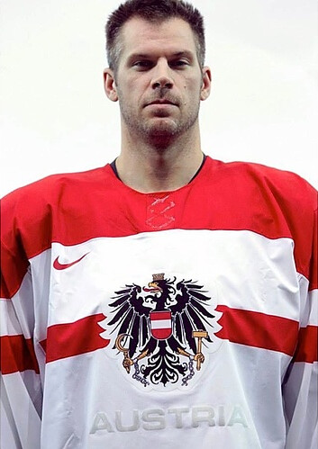
Like many of Nike's hockey uniforms for Sochi, this one is based on the team's national flag. Unfortunately, the Austrian team has been stingy with photos, so it's impossible to assess the full uni set, but the available evidence suggests a reasonably solid design. Too bad about that "Austria" lettering below the crest, though -- could have been scrapped or at least jazzed up a bit. Grade: Incomplete, but probably B-ish.
Canada
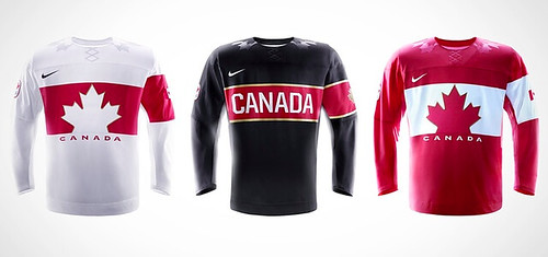
Very nice base designs. And how often do you see striping or logos on one sleeve but not the other? Interesting! Still, the Canadian wardrobe has fallen prey to overdesign. For starters, does any team in a short tournament really need three separate jerseys? And those maple leaf outlines on the shoulders are a bit much. A very good set, but it could have been even better. (Additional photos and info here.) Grade: A-
Czech Republic
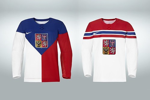
Another design based on a national flag, and it totally works. The color-blocked jersey may make traditionalists wince, but it's a beauty, and the predominantly white version is gorgeous in its simplicity. Bravo. (Additional photos and info here.) Grade: A
Finland
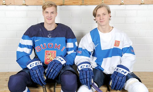
The white jersey is yet another flag-based concept. Love the asymmetry, but the Nike swoosh ends up in an unfortunate spot. Not as fond of the blue-on-blue jersey, especially because the flag pattern on the sleeve is so big it feels unwieldy. Grade: B
Latvia
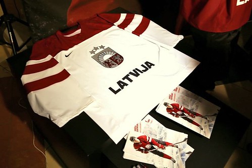
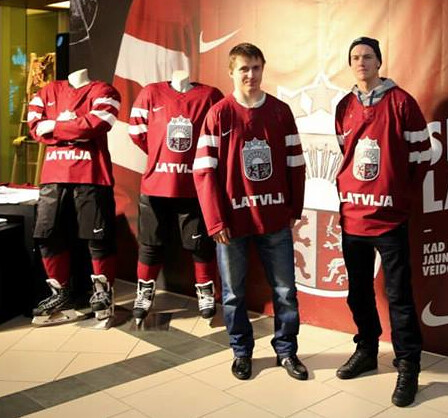
Nothing to complain about. Also nothing to get excited about. If forced to choose, the choice here would be the white version, but both feel a little generic. Grade: B-
Norway
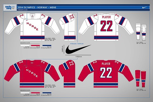
One of the few designs that features neither a flag-based pattern nor a national crest. Feels plain Jane but not particularly retro, which means it's the worst of both worlds. Maybe they didn't want to steal the spotlight from their countrymen on the curling team. Grade: C
Russia
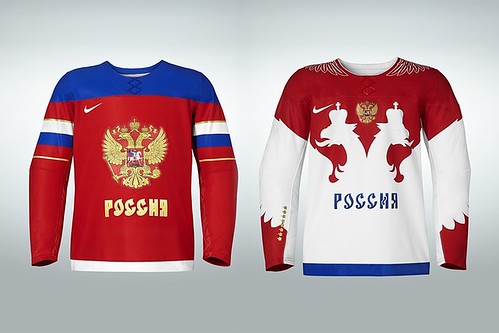
You'd expect the host team to go all out with a great uniform set, and that's definitely the case here. The white design is particularly fine, with the wings on the shoulders and those silhouetted eagles' heads mimicking the ones in the national crest positioned between them. But the red jersey is a keep, as well, and that gold really makes the sleeve stripes pop. A wardrobe the home fans can be proud of. (Additional photos and info here.) Grade: A
Slovakia
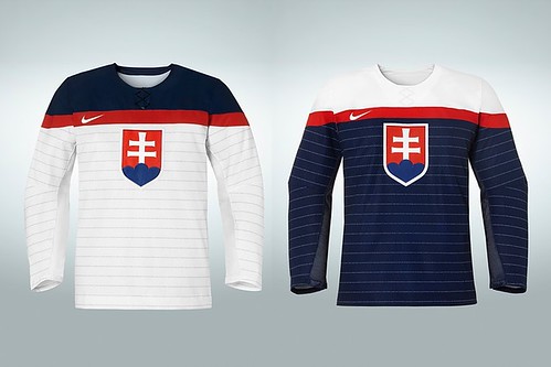
Lots to like here. More than any other set in the Games, these jerseys look like sweaters, thanks in large part to those stripes. Take a closer look and the stripes turn out to be the lyrics of the Slovakian national anthem -- a nice touch. (Additional photos and info here.) Grade: A
Slovenia
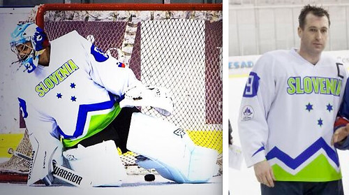
Whether the Seahawks are wearing it in the Super Bowl or Slovenia is wearing it in the Olympics, neon green just doesn't feel like a color to be taken seriously. No sign yet of the Slovenians' dark jersey, although it will apparently look like this. Definitely the weakest set of the Games. Grade: Incomplete, but probably D+-ish
Sweden
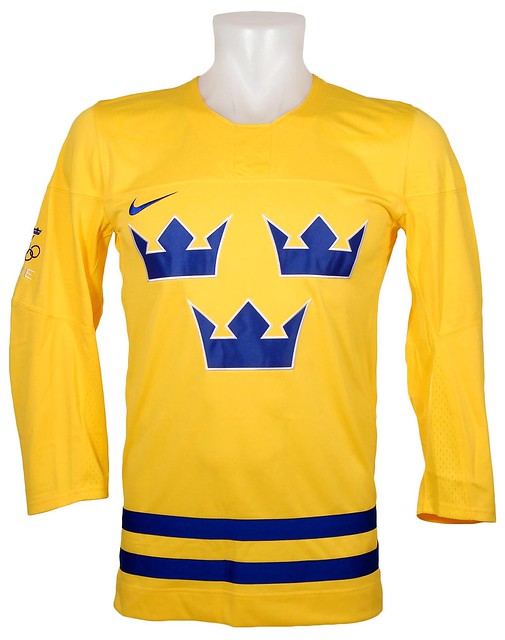
The Swedes' yellow jersey follows the same basic template they've used for the past several Olympics, but with no sleeve stripes or sleeve numbers. There's a fine line between simple and plain, and this jersey is now on the wrong side of it. The dark jersey, which will be blue, hasn't been released yet. (As a bonus, here are Rangers goalie Henrik Lundqvist's mask and pads for the Games.) Grade: Incomplete, but probably C+-ish
Switzerland
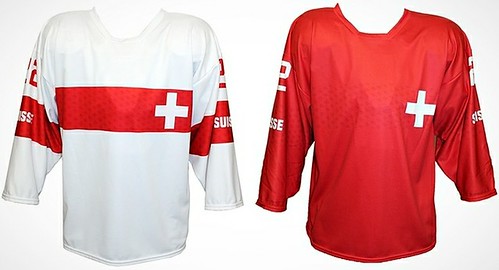
The Swiss (who haven't yet done an official unveiling of their uniforms, although the designs were leaked in a promotional video a few months ago) face a familiar problem: When you see those colors and that cross symbol, it's hard not to think, "Hey, look, it's a team of medics!" No ridicule or condescension intended there, especially since the designs are based on the Swiss flag, but come on -- you probably had the same instinctive reaction. Grade: B-
USA
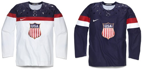
Great crest! But the color-blocked white jersey has so much more pizzazz than the solid-blue design, which feels too tame by comparison. And what is the deal with all those stars sprinkled across the shoulders? Way too cheesy and overdone. (Additional photos and info here.) Grade: B
Paul Lukas hopes a Red Wings fan shows up in Sochi and tosses an octopus onto the ice, just for kicks. If you liked this column, you'll probably like his Uni Watch Blog, plus you can follow him on Twitter and Facebook. Want to learn about his Uni Watch Membership Program, be added to his mailing list so you'll always know when a new column has been posted or just ask him a question? Contact him here.