
The Los Angeles Clippers unveiled their new logos and uniforms last month, and the reaction was a nearly unanimous thumbs down, with many fans saying, "Are you kidding me? I could do better than that!"
So we gave you the chance to back up your words by inviting Uni Watch readers to submit their own concepts for redesigning (or, if you prefer, re-redesigning) the Clippers.
The response was strong in terms of both quantity and quality. Here are the best submissions we received (for each design, you can click on the image to see a larger version of it):
1. Best overall design: Dan Kennedy
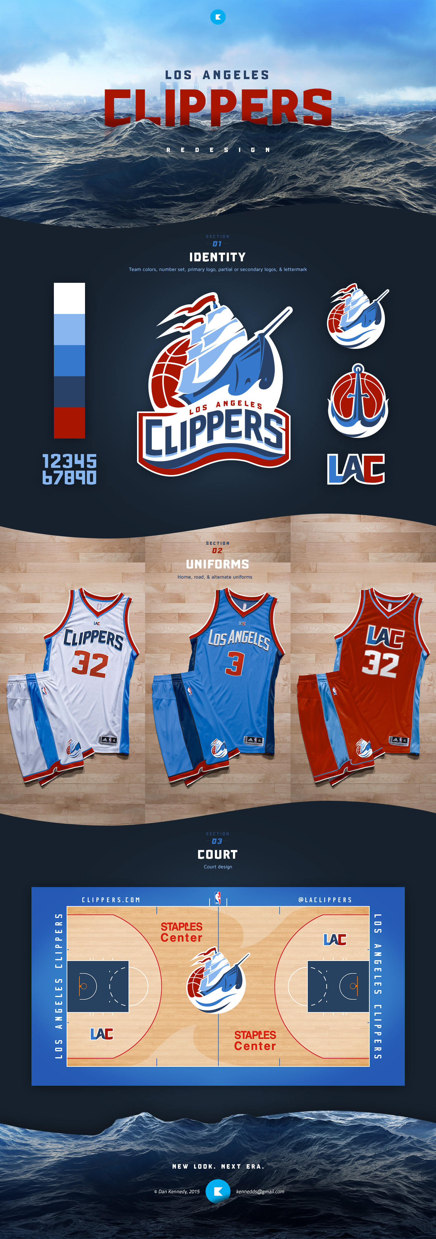
Many, many readers submitted designs drawing upon a clipper ship theme. Dan Kennedy did the best job of integrating that idea into a simple but effective package. The wavy chest lettering on his home and road uniforms suggests the roll of the ocean but isn't severe enough to prompt any jokes about getting seasick, and the little wave on his red alternate jersey is repeated on his very nice court design. Even the obligatory basketball in the primary logo works, because it suggests a setting sun behind the ship. Nicely done.
2. Runner-up design: Adam Hainsfurther
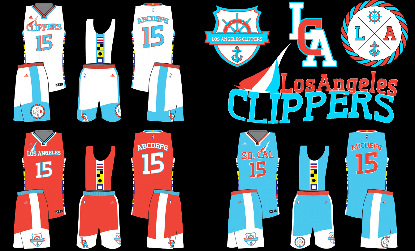
Adam Hainsfurther's approach was similar to Kennedy's, with rolling typography and several other seafaring flourishes. He also included the team's old nautical flag iconography on the jersey side panels (although it would probably work better on the shorts), and his alternate jersey's "So. Cal" chest insignia is an interesting approach that nobody else came up with.
3. Best reinterpretation of the team's name: Randy Miller
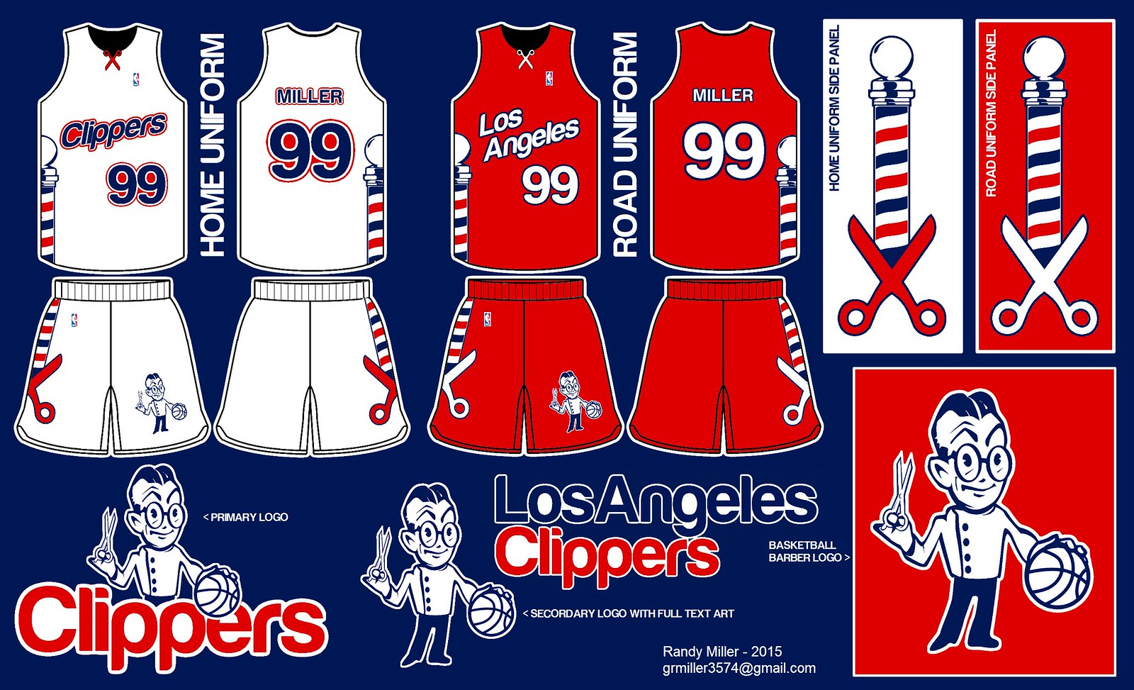
Several readers decided to have some fun with the word "clippers" and go with a barber shop theme. Randy Miller's entry was the best of these submissions, featuring a barber pole on the uniforms' side panels, clever use of a scissors icon on the jersey collars, and a snappy little mascot character.
4. Best "LAC" logo: Daniel Abela
The Clippers' recent makeover included a stylized "LAC" logo. Daniel Abela did a good job of making it even more stylized and more modern-looking -- a good example of a mark that works well as a powerful geometric shape while still communicating its core letters. Abela presented it in several additional configurations, which you can see here and here. "The whole thing took me less than two hours, and I already prefer it to what they're going with," he says. Hard to disagree.
5. Best opponents' uniforms: Tom Bierbaum
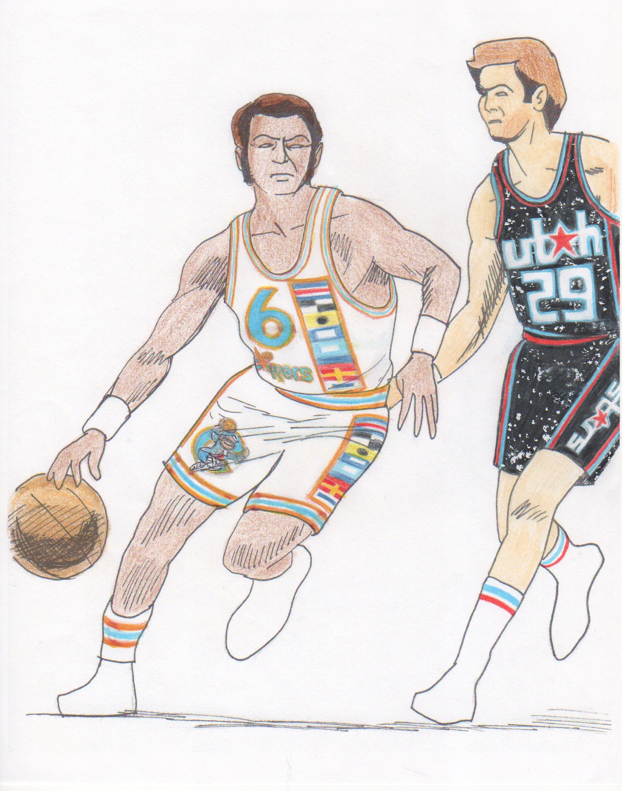
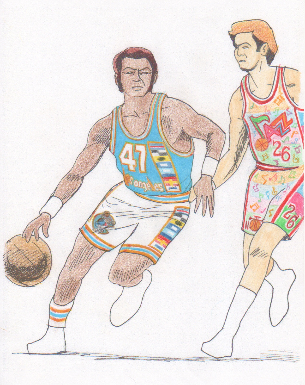
Whenever we do these design challenges, reader Tom Bierbaum goes the extra mile by providing two or even three new uniform concepts -- one for the team under consideration and then one or two for the opposing teams in the illustrations he whips up. In this case, he's envisioned an alternate universe in which the Jazz's name is given back to New Orleans and Utah's NBA team is renamed as the Stars (hearkening back to the old Utah Stars of the ABA). His Clippers uni concepts are OK, but that Stars design -- wow! That's a keeper. And the Jazz design, while too fanciful for today's NBA, is a blast. As usual, Bierbaum also came up with a really fun mascot character, but his best work this time around was definitely the Stars design.
6. Craziest concept that some team should go ahead and try: Vee63
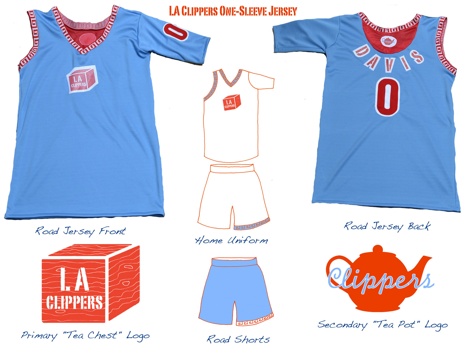
You think sleeved NBA jerseys look weird? How about a one-sleeved jersey? That's what Vee63 (not his real name, obviously) came up with. Here's how he explains it:
"I wanted to clear out space on the chest by moving the uniform number to the sleeves. But many players don't like the sleeves because they feel constricted, so we'll go with no sleeve on the shooting side and a numbered sleeve on the opposite side. (Left-handed shooters will receive a left-handed jersey.) The overall theme relates to the traditional use of clipper ships for the tea trade with China: The primary logo is a tea chest, the secondary logo a tea pot."
If you think the blue jersey looks particularly realistic, that's because it's not a digital rendering -- Vee63 actually made a prototype of his own design, as you can see here and here. Now that's dedication!
Honorable mentions: Luke Gordon came up with a really good "LA" logo that looks like a ship's sail. Ryan Fox also came up with an interesting way of integrating "LA" into a sail-based design, although his lettering for the team name feels too frivolous. The Los Angeles skyline was another popular visual theme. Carlos Foglia made the best use of it, incorporating it into an effective basketball-shaped logo. Brent Hatfield did something that more people should probably do: He Photoshopped his logo and jersey designs onto a press conference photo. Not bad, right? He also provided a more traditional mock-up sheet. Conrad Burry drew upon several aspects of the Clippers' past to create a handsome logo set and very nice home, road, and alternate uniforms.
Want to see more? You can check out all of the Clippers redesign submissions were received here.
Paul Lukas will have more design contests soon. If you liked this column, you'll probably like his Uni Watch Blog, plus you can follow him on Twitter and Facebook. Want to learn about his Uni Watch Membership Program, be added to his mailing list so you'll always know when a new column has been posted or just ask him a question? Contact him here.